Review: HEY.com
HEY is a new email service designed, built, and backed by Basecamp. And whether or not you have a bad relationship with email, HEY offers a fresh perspective on a fixture of everyday life. Here are my first impressions 10 days into the free trial.
Why HEY?
I don’t get a lot of personal email. A high-volume day for me is receiving 20–30 emails. And of those, only 1 or 2 warrant a reply. The Gmail web interface paired with the Simplify extension has done a good job keeping my inbox clean. So why bother with HEY?
Curiosity (and/or marketing) got the best of me. I read several testimonials from people I follow including Kevin and Darya Rose, Adrian Holovaty, and Ryan Hoover. I also respect the Basecamp team. They’re smart, opinionated, and aren’t afraid to try new ideas. I wanted to see what they came up with.
First impressions
HEY is $99/year. If you’re used to a “free” service where you pay with your personal data, $99 may feel like a lot. But I think you have to set aside cost and look at value when evaluating a product. e.g., $99 may be a small price to pay if HEY saves you hours a year organizing your inbox. Just don’t be upset because Basecamp is charging money. They’re a business, and a lot goes in to building, maintaining, and supporting software.
HEY.com is a great domain name. For some, having an email address at HEY.com may be worth the price of admission. There’s a good chance you’ll be able to grab a desired username since the service is new. And you get to keep your HEY.com email address for life as long as you pay for one full year. That being said, I got one of my top three username choices and the novelty wore off after the first week. I’m more interested in the features and service.
The sign up process, onboarding, and forwarding setup were a breeze.
The Screener: I like the manual process of screening new senders before they can make it into my “Imbox.” Although, I’m guilty of leaving some emails in The Screener for days because I worry about miscategorizing them or losing them altogether. This is despite knowing I can change the status of a screened or categorized email at any time. (Screened out emails are hidden, not deleted.) This isn’t a completely irrational thought, though.
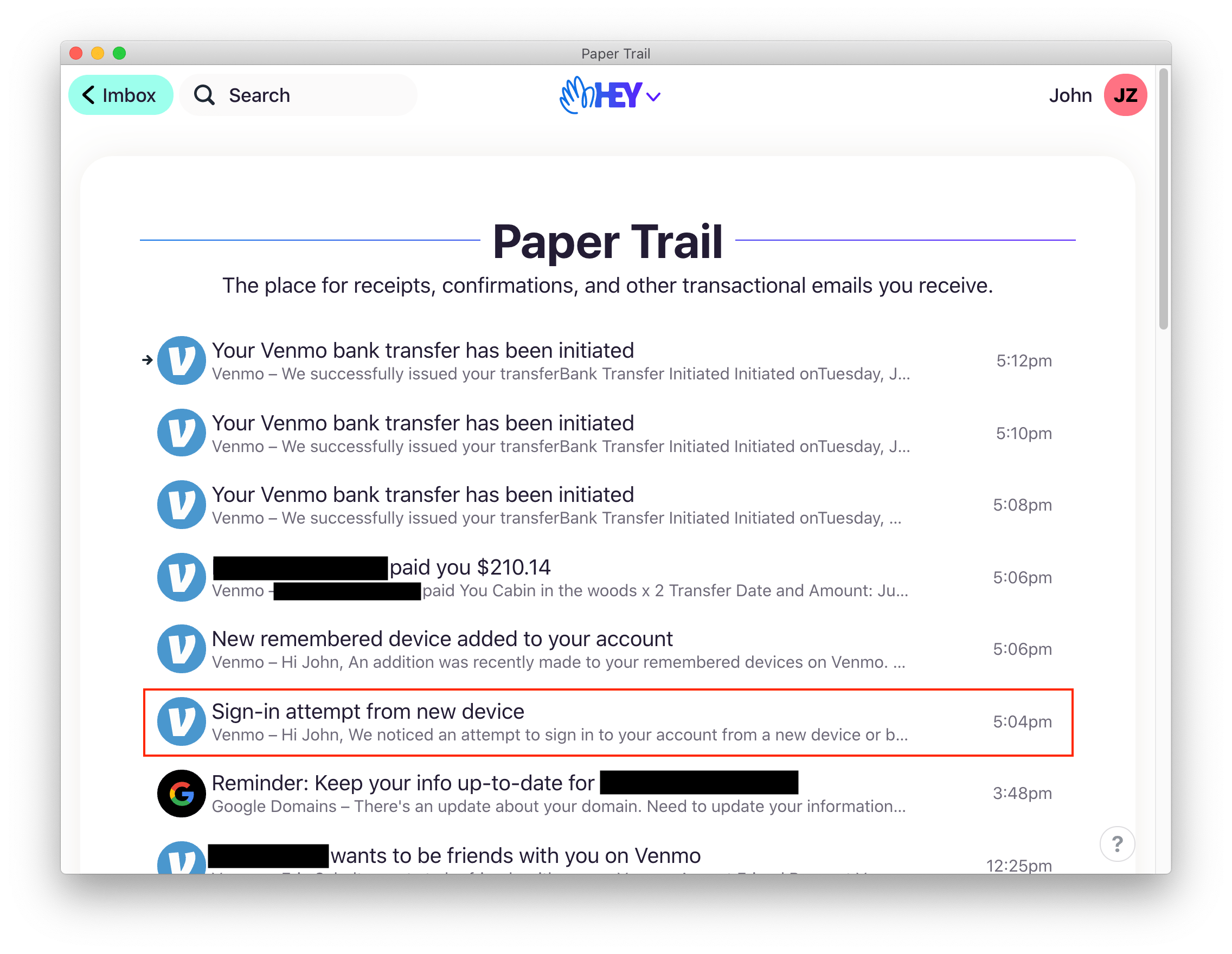
HEY assumes every email coming from an address should be treated the same way, but that’s not entirely the way email works. I’ll use Venmo as an example. Most emails from Venmo are sent from
venmo@venmo.com. I want the majority of them out of the way because they’re transactional, but I definitely want to see a sign in attempt on my account.

A Venmo security email gets buried
Imbox: Few emails make it to my “Imbox.” Most go directly into The Feed or Paper Trail. I feel a real sense of calm when using HEY because there isn’t much front and center that needs my attention.
The Feed: The Feed is my favorite feature. Emails in The Feed are out of the way until I’m ready to look at them. And scrolling through multiple open emails is a quick and easy way for me to see if there’s anything I want to check out.
Paper Trail: It’s nice to see a history of my transactional emails in one place. I can do this with a label in Gmail, but it would be a little more effort.
Notifications: Notifications in HEY are off by default but you can turn them on for specific contacts and threads as needed. I spend a non-trivial amount of time turning off notifications for other services, so I appreciate HEY’s approach.
Security: HEY requires an account password of at least 12 characters, and two-factor authentication is required for all paying customers. Setting it up is a straightforward process, and I like that physical security keys (like the YubiKey) are supported at launch. My bank doesn’t even offer this feature 🤦.
Clips: I have two emails from Dec. 2019 sitting in my Gmail inbox at the time of this writing just so I can refer to a quote in each. There’s probably a better place to put them in the grand scheme of my online organization, but Clips are helpful in this situation.
Merge: I’ve used the merge feature a handful of times to combine emails from eBay and PayPal that were related to the sale of an item. It was helpful, but I wouldn’t be negatively affected if I couldn’t do it tomorrow.
Apps: HEY works in your browser and has full-featured native apps for Android, iOS/iPadOS, Mac, Windows, and Linux. I use the web, Mac, and iOS/iPadOS versions and they’re fine. My only gripe is that the HEY menu isn’t present on each screen in the iOS/iPadOS apps, so I have to make a few extra taps.
Set Aside and Reply Later are useful but they don’t feel too different from snoozing or flagging emails.
Focus and Reply: Batching is an effective way to process email, and that’s where Focus and Reply really shines. See all of your Reply Later emails at once and fire away—one after the other while staying on the same screen. Unfortunately, I don’t get much value from the feature because I don’t have to reply to a lot of email.
Privacy: I appreciate and prioritize my privacy as best I can. I like that HEY blocks email tracking by default. However, there are tradeoffs, and I wonder how pixel blocking will affect individuals or small businesses that rely on email tracking.
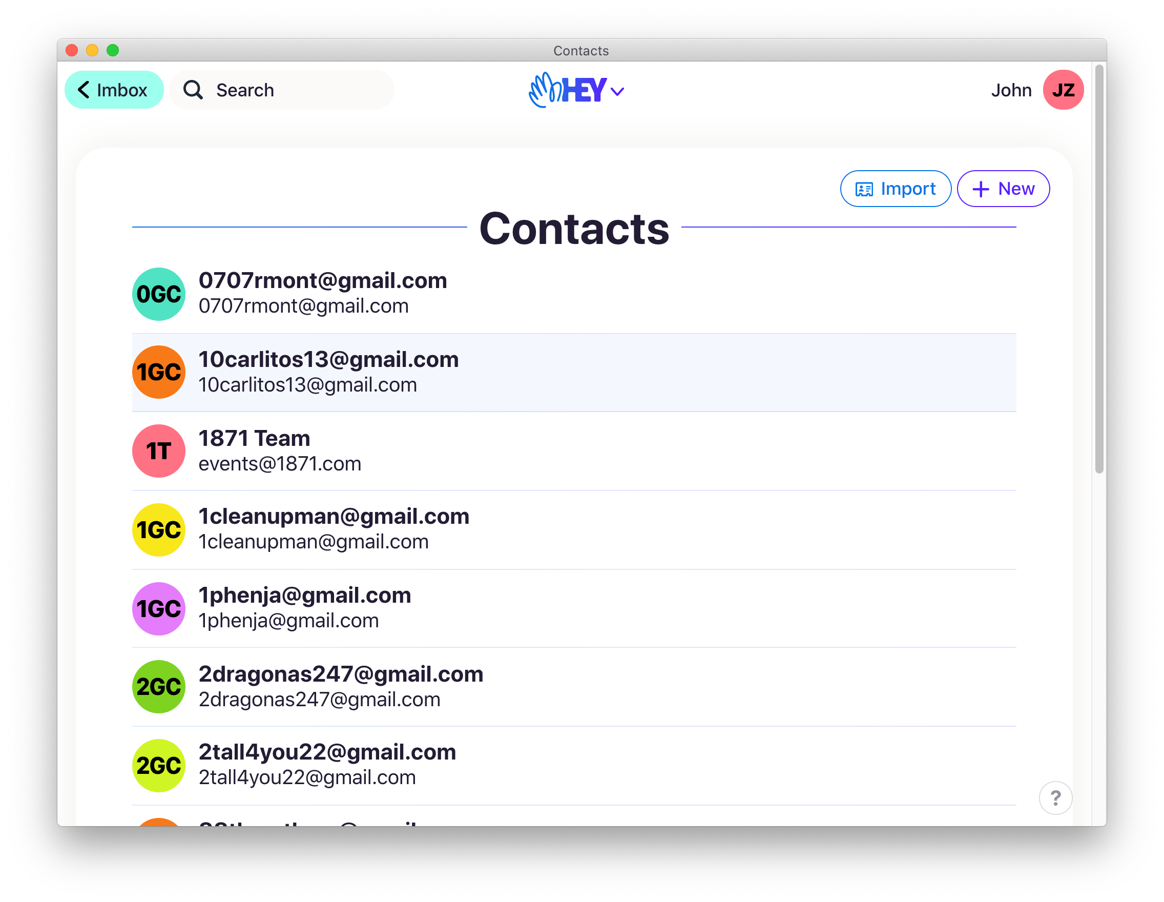
Contacts: Every person you send an email to or receive an email from gets a contact. They’re a mess, but I like how threads and files are organized under each. Even though contacts could be a separate app, I hope to see improvements in this area.

Contacts, even for spam
It’s been difficult for me to separate my calendar and email. HEY attaches
.icsfiles that can be used to import events into existing calendar apps, but old habits die hard. I think there’s a reason so many applications bundle email, calendar, and contacts.HEY has more unique features such as bundling, private notes, and a Speakeasy code, but I haven’t had a need for them, yet. Learn more on HEY’s features page.
HEY isn’t for everybody. And that’s okay. I appreciate the new perspective Basecamp brings to email. They did a lot of things right, and I hope other companies take notice and continue to push email forward.
With 4 days left in my trial, I have yet to decide if I’ll pay the $99 for HEY. It would be an easy yes for me if there wasn’t the high cost of switching emails. I have over 300 online accounts. It’s probably not worth it if I can’t justify the value like I mentioned above, but there’s a lot of promise. We’ll see what the future brings.
HEY is available today without an invitation. Learn more and sign up on HEY.com.
Update July 4, 2020: I paid for the first year of HEY. Converting my existing web/app accounts is going to take time, but I really appreciate the sense of calm HEY brings, and I check my email much less often.